At a minimum these could include:
- a unique case identifier (preferably in collaboration with country where diagnosis was confirmed and used by all)
- age
- sex
- date of illness onset (DOO; when they first became ill; preferred value to use top plot cases along the bottom axis of the graph)
- date of hospitalization (DOH; if no DOO - the I plot using this*)
- date of laboratory confirmation
- town & country of diagnosis
- whether a healthcare worker
- whether underlying disease (comorbidities) were present
- animal contact if a possible or known zoonotic disease
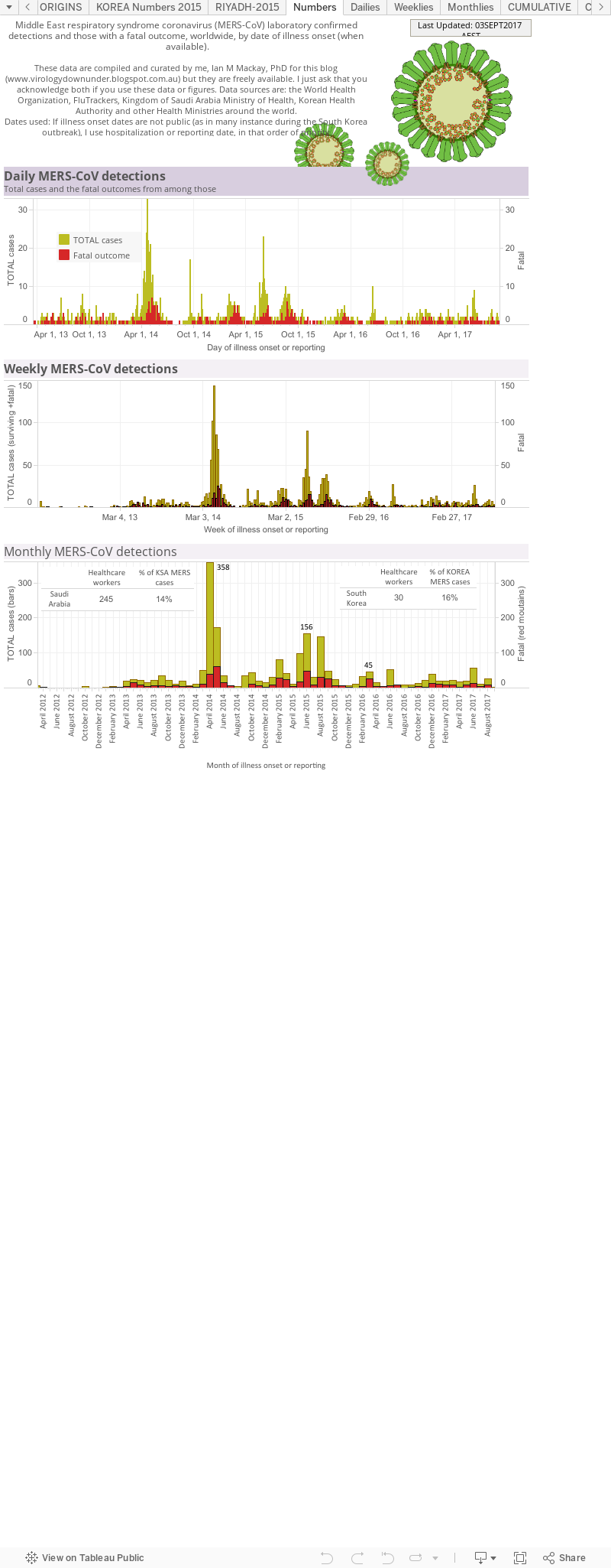
This breaks down the living (yellowish) and dead (red; when they died) people from which MERS-CoV was confirmed by a laboratory, either as viral RNA-positive using RT-PCR or by the detection of an antibody response. The graphs also show the counts as per day, per week and per month to cover a range of different 'ways' of looking at the numbers. In the Monthlies graph, I have nested a Table that shows how many healthcare workers (HCWs) have been infected and that that equates to as a proportion (%) of all detections from that country.
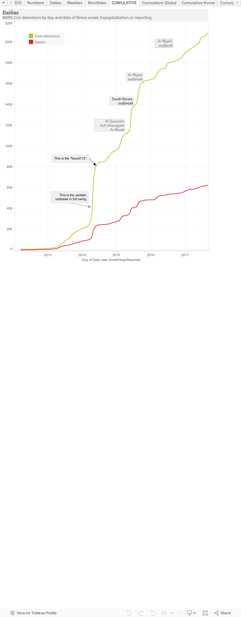
This is a cumulative curve, It adds the newest case numbers to the total from the timepoint before and so it shows the growth of cases - in this case, of all MERS-CoV detections worldwide. I've marked some pints of interest. These are usually clusters or outbreak and cause a sudden rise in case numbers, seen as a steep curve; a change in rate of case growth. As the cluster or outbreak resolves, the curve "slows down" which can be seen as it levelling off to a horizontal line.
Data viz 3.
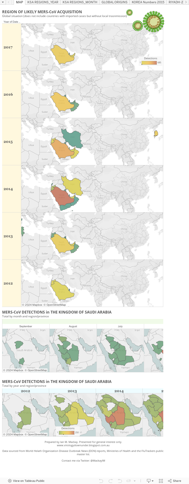
This is a series of 'heat' maps with time. They plot the density of MERS-CoV human cases in terms of colours - the more cases in a region, the more warm (red) the colour is. The fewer cases, the more cool (green) it is. There is a scale to show you some more detail.
Data viz 4.
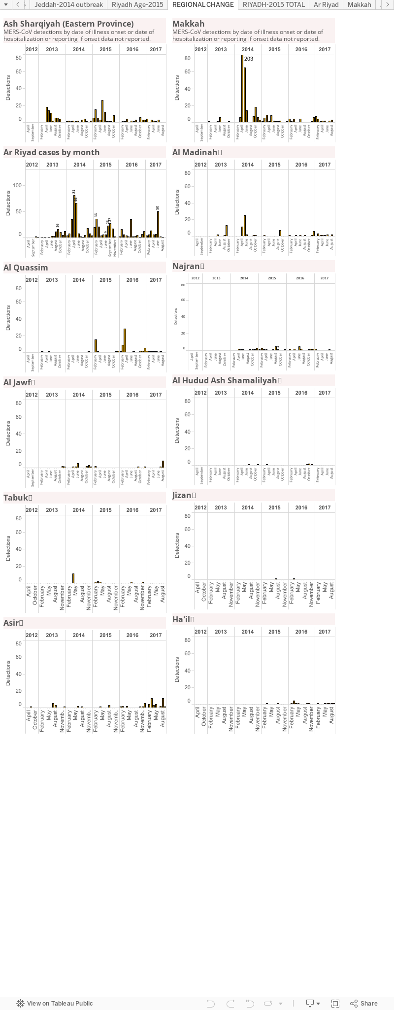
MERS by region of the Kingdom of Saudi Arabia. This is another way to track which region or province is the hottest spot. It does not account for the creation of "MERS-specific clinics or hospitals to which cases from other regions may be being transported.
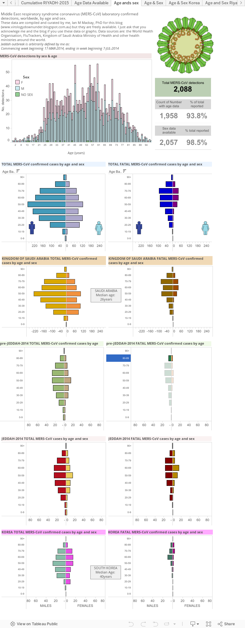
MERS by age and sex. This includes a table of the current global total number of MERS-CoV detections and highlights the gaps in my line list of age and sex data.
There is a global age and sex bar graph (male-blue;female-pink-sorry; green-no sex data).
Next are age/sex pyramids for the world, the Kingdom of Saudi Arabia, pre-Jeddah and then the Jeddah and South Korea hospital outbreaks.
These graphs highlight the different distributions during times of sporadic cases or times of clear outbreaks. They also highlight that more cases are male and show some difference between cases and fatal cases as well as differences between Saudi Arabia and an outbreak in another country-highlighting how important the health of the community is to the impact of the same virus.
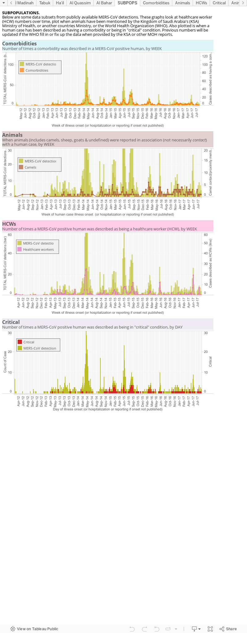
This is an odds and ends viz of some subpopulations. 1st there is a panel looking at the number of comorbidities over time (orange line) against the total case numbers (pale brown mountain), globally; 2nd is the number of times an animal (brown), or specifically a camel (yellow), is mentioned alongside a case; 3rd is a plot of the cases identified as having a role in healthcare, again against a backdrop of the total MERS cases worldwide. This lets us see increased spillovers and, usually with hindsight, associate them in time with a spike in cases. It also shows the intimate relationship between MERS and the healthcare environment as healthcare worker numbers spike along with an overall rise in cases.
Data are derived from the World Health Organization, FluTrackers and various Ministries of Health.
The chart above, as with all on VDU, is made for general interest only. It is also freely available for anyone's use, just cite the page and me please.
No comments:
Post a Comment
Note: only a member of this blog may post a comment.